
DVD Cover
- One of the main things that make me identify the print text is the actual title of the movie, 'Ill Manors'. As you can see, the DVD cover shows the title of the text in the centre and is written in large. Another central image that I can see is the main protagonist behind the movie title with his arm overlapping the title - he is also holding a gun in his hand. This helps me identify that it is a DVD cover because of the fact that it has the main character of the movie and also, it gives the movie rating on the bottom left of the print as it does in mostly every single DVD cover. This gives the audience awareness of what the content may be in the movie.
- One of the main things on this cover made it help me identify that it is related to Ill Manors in the gun. The movie Ill Manors has a lot of action codes which is then related to crime which is related to danger. Therefore, the gun itself is an action code, as it is a symbol of death or someone getting injured. Another thing that helped identify the film was the way the title of the movie was layed out. The part where it says 'Ill' looks as if it is sized into a block of flats which is what people in the movie live it. This therefore straight away tells the audience that this may be in a ghetto area and something bad will happen in this movie.
- Another similar sort of print work, that is related to this particular print work would be the soundtrack album. The soundtrack album and the movie have both got the same name, 'Ill Manors'. This is a synergy because more than one piece of the artists work has got a link which is being the title of both pieces of work.
Billboard Poster
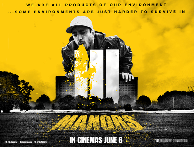
- Another thing that I have identified in this poster is the main character and the name of the movie. This is similar to the DVD cover as it presents the same character in each and the layout of the word 'Ill' has been presented in a block of flats again. This is very powerful for a print like a billboard poster because these posters are what the movie would mainly advertise in key areas, e.g. on a main road where many driver pass by everyday. A popular character like 'Riz Ahmed' would help attract the movie as he is popular and has got a reasonably large fan base. Another key convention shown in this billboard poster is the 'tagline' shown at the top and in the centre. This tagline is extremely powerful for any print work because it gives a feel to the audience of what the movie is about or what the audience may think it is about as sometimes, the production company may not make a tagline as obvious.
- As you can see in the middle of the poster, it shows the main character vomiting onto the movie title. This can show the audience that this is going to be a disturbing movie which may contain many disturbing things as another link to this is that the movie rating is 18 and can show anything, e.g. swear words, violence, sexual actvities etc. But in this case, the character is vomiting onto the title or some may think of it as a block of flats which can suggest that the city itself can be dangerous.
- This is linked to the DVD cover as it shows the same layout of the way the movie title is typed up and how they have used the same character in both prints and how both of them have been centralised.

Billboard Poster
- The main convention that I have spotted in this print work is the consistency in how the print has been designed. As you can see, it started of with a triangle at the bottom which is also centred. This shows the main protagonist yet again (Riz Ahmed). Then it expands into bigger triangles which then creates a pattern and in each space, it shows different characters from the movie. Also, in the centre of the print (rule of thirds), it yet again shows the same layout/design of the movie title as it does in every other print that I have described above. Another thing that has been shown is the ratings that have been given by different people which therefore gets the viewers attention as it is a print advertisement document and it needs to show the audience ratings. For example, if one of the audience favourite actors gave it a 5 star rating, they would most likely watch the movie as they've been attracted by their favourite actors etc.
- The contrast between black & red relates to the movie itself as the movie has been located in a dull area. The dark parts in the print would relate to when the different crimes are happening and the red colours link to blood; This tells the audience that this is going to be very brutal and scary. However, this particular print hasn't given the movie rating.
- The synergy that this print can relate to is the DVD cover as it gives ratings of the movie by different people/company and it has presented the movie title in the same way, ALWAYS - Big, white and in a style of a 'block of flats'.
No comments:
Post a Comment